6 Signage Design Principles You Need to Know
You might have noticed that we’ve been concentrating our blog posts on signage a lot lately. This focus on both interior and exterior signs is because are these pieces of your marketing collateral are critical to your business’s successful overall branding and marketing strategies.
In fact, you’ll find tons of survey data that prove your customers are paying attention to signs—whether consciously or not. For instance, a FedEx Office survey showed that “eight in 10 (76%) American consumers enter a store they have never visited before based on its signs, and nearly seven in 10 (68%) have actually purchased a product or service because a sign caught their eye.” Those stats are impressive!
Unfortunately, though, designing effective signage can be extremely difficult for even experienced graphic artists. Especially when it comes to large-scale exterior signs that need to help customers locate your business, there are many rules and best practices to follow to get attractive and readable results.
Because we don’t want you to waste money and time revising your sign designs over and over again, we’re sharing a few of those sign design rules with you today (though there are more, as well).
Of course, if you don’t want to worry about all the ins and outs of the design process, give us a call here at The H&H Group! The experienced sign designers at our full-service sign company will take the lead so your team can focus on more pressing business matters, like ramping up to serve all those new customers your signs will bring through your front door!
1. Prioritize Legibility
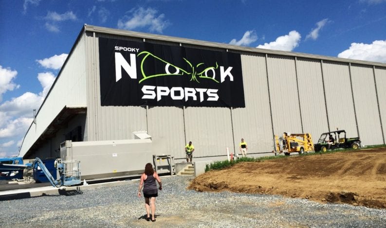
Signs that aren’t legible are pointless. After all, what good is wayfinding signage that requires your visitors to squint to tell where they’re supposed to go or tradeshow and events signs that make people ask, “what is this business?”
But did you know that poor signage can actually hurt your business? That same FedEx survey we referenced above showed that fully half of all respondents are so put off by poorly designed signs that they have decided not to visit or interact with a business because of them!
Illegible signs make people feel unsure and confused, and that can make them decide your business isn’t worth their time. This news is especially unfortunate for retailers with brick-and-mortar locations that rely on strong foot traffic, of course.
2. Avoid Visual Clutter
One way to make sure that your signs are readable is to keep your overall design simple with bright colors and clean lettering. You don’t want a lot of patterned backgrounds or complicated images competing for attention with important text information (like your business’s name), especially on outdoor signs that are meant to be viewed from a considerable distance.
You’ll also want to consider white space around your messaging and imagery. The United States Sign Council Foundation suggests a ratio of 40% content to 60% negative space.
3. Create Balance Between Text and Graphics and Think About Viewing Distance
Effective signs will strike a comfortable balance between words and images within the content area, calling back to our previous rule of avoiding visual clutter.
There are somewhat complex equations that determine how readable your sign panels will be based on factors like viewing distance, height, if your sign is targeted toward people on foot vs. people driving or riding in passing vehicles, and more.
Again, the United States Sign Council Foundation is an excellent resource for these guidelines. And our sign designers here at The H&H Group can also guide you on various rules around creating the most effective signs for your needs.
4. Use Appropriately Contrasting Colors
Have you ever looked at a piece of printed material or even a webpage and thought, “wow, that color combination is hurting my eyes!” Indeed, not all colors play nicely together, and the result of using bad combinations can make your signage downright unreadable.
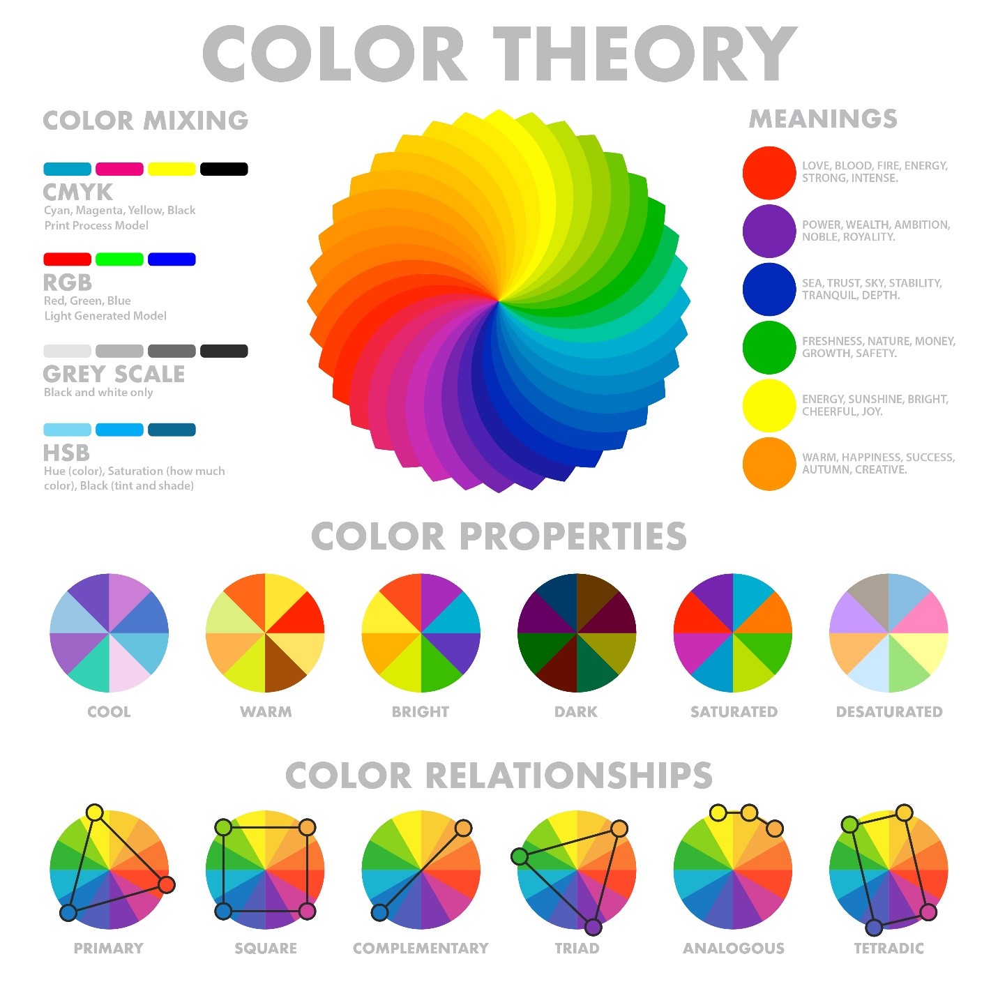
Consulting the color wheel to determine which colors might work together for both legibility and an attractive look is an excellent place to start. Still, for non-designers, the relationships between different colors can be a bit perplexing.
It’s important to note that you’ll also need to think about the lighting in the environment where your signs will be located. Outdoor signage will have different color requirements than those indoors. The highest contrast designs will be most important in low-light settings. Of course, if your sign will be backlit or illuminated, that introduces other considerations best handled by the sign design pros at The H&H Group.
5. Keep the Fonts Simple
If you’ve begun to notice a theme with our rules here, we’re not surprised. Most points about sign design come back to the fact that legibility is critical. And this means that your typefaces need to be easy to read. Period.
Consider your audience too. Avoid fonts that are overly dramatic or look like handwriting. If your sign is geared toward children, simple plain fonts will be better than the script and Old-English-style fonts.
6. Be True to Your Brand
Even if you don’t have a branding style guide for your business’s marketing materials, you probably have go-to colors and fonts that you tend to use. You likely also have a logo. When designing effective signs, you’ll need to incorporate these key branding elements so that people seeing your signage don’t have to question to whom they belong.
Does your current logo not read clearly on your signage, or are you not sure it represents your brand? It could be time for a refresh. Need help? We can help you out with this marketing and branding feature here at The H&H Group!
Need Some New Signs for Your Business?
When you’re ready to start designing new exterior or interior signs for your business, there is no better resource for sign design and printing services in Central PA than The H&H Group! Don’t go it alone in creating business signs! Our talented team will help you realize your vision while ensuring that your signage is readable, eye-catching, and conform to local code rules (for exterior signage), where applicable.
Complete our pricing request form with a few details about your next sign project, and we’ll be in touch to start the conversation with you.