The Power of Going Against Trends
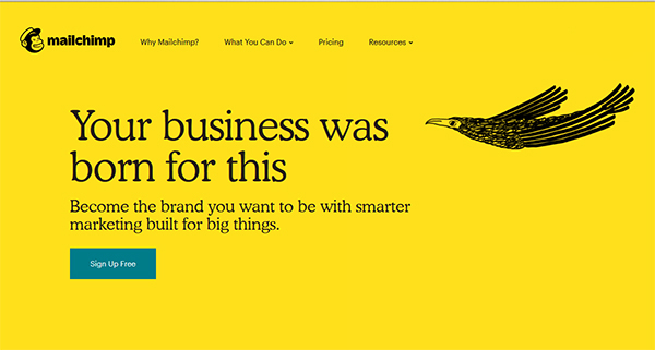
Logging in to Mailchimp to fire up this week’s edition of Brand New, I was taken aback by the company’s rather jarring new rebrand.
If you haven’t seen it, the main components are a dirty mustard yellow in place of the company’s previously ubiquitous bright blue and lots of hand-drawn black-ink animations. Freddie the Chimp is still in attendance acting as the company’s logo and sort-of mascot, although he did get a slight makeover as well.
Perhaps the most bizarre twist is the font change. Mailchimp has chosen to shun the clean, san serif fonts that established tech companies typically embrace and instead opted for a reworked version of a 100-year-old typeface.
Why not follow the pack?
The clean, smooth branding adopted by most successful, large tech companies is a standard. When people see these brands they equate the simple fonts and smooth lines with strength, stability, and trustworthiness. Why would a brand not want to publicly claim these virtues through established branding practices? Why not do what people expect and understand? What’s the point of not following established cultural norms?
To answer those questions for Mailchimp, we need to look at the company’s history and values. A big part of Mailchimp’s culture and worldview is to keep things human. They also like to think of themselves as a little weird. Despite their massive growth, they still maintain that focus. This slightly off-the-wall branding helps them convey that.
It’s like they are saying ‘Hey, we’re still the same scrappy brand as when we were a startup. And we can maintain that while still being an extremely reliable, grown-up company and a leader in our industry.’ By embracing quirky branding, Mailchimp is letting us know that it’s cool to stay true to yourself. Just because you’ve found success doesn’t mean you have to conform.
Why does this make sense?
Mailchimp started as a side project for its founders. It was itself a small business helping other small businesses promote and grow themselves. Even after 17 successful years of growth, Mailchimp is still focused heavily on the little guy. Their customers are mainly small businesses trying to differentiate themselves in crowded markets, tiny companies trying to make a name for themselves, and startups looking to create relationships with their growing customer base. This focus on small business is helped along by Mailchimp’s memory of having started out in those same shoes. Rather than slip into corporate adulthood in the way they present themselves now, they chose to stay true to their roots as a quirky, playful but hardworking company because this is what resonates with their customers.
Angie Shih is a strategist at the brand agency Mailchimp worked with on the rebrand. “Ultimately, the goal is to make Mailchimp a beacon for its own customers, who are growing brands trying to figure out how to speak to their people,” Shih told Fast Company in an interview.
Will it work?
This new brand motif is definitely an attention-getter. It’s a pretty gutsy move in some ways, but Mailchimp is counting on their customers and target market ‘getting it.’ Considering the company’s success to this point and their ability to understand and connect with their audience, this move will likely be well-received. They are a marketing company, after all, so they know a little bit about this kind of thing. The authenticity that this rebrand represents is inspiring in and of itself.

Leave a Reply