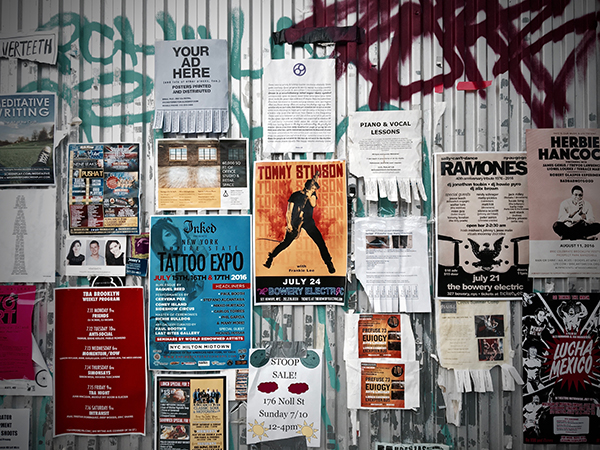
Designing an Effective Event Poster
When creating a poster or flyer to promote an event, it can be tempting to pack in as much info as possible. After all, you want to get the word out about all of the great things your event will be. You want your potential attendees to be fully informed. But including every last detail on a promo piece like a poster or flyer can actually have the opposite effect. To grasp why, we need to understand the purpose of the poster/flyer as a marketing tool.
Think about where you encounter posters advertising events. You may see them on the street, in a coffee shop, or at a stadium or other venue. You are not actively researching a future event in these places. You are just seeing the poster in passing while walking to work, grabbing a coffee or hitting the restroom during a concert, conference or game. In order to be effective, a poster needs to quickly get your attention. It needs to get you excited about whatever it is trying to promote. It needs to entice you to seek more information at a later time.
Include top-level information about What, When and Where.
The purpose of a poster is threefold. First, it should draw attention to your event. Second, it should convey the most-critical info about the event quickly. And third, it should direct readers where to go for tickets or more info.
Think about how people consume the information on a poster. They skim. If you crowd the poster with a large amount of information, you lose your opportunity to get the basics across. Even if you include all the right things, people lose the ability to quickly digest what you are saying if you say too much at once. Remember that your poster is an attention-getting device. It should help people become aware of the event and direct them somewhere else, usually a website, for more details.
Don’t make the mistake of overloading your piece with tons of detail. There is a sweet spot for how much information to include. Here’s a quick guide to help you decide if info belongs on a flyer or if it should be saved for another marketing channel.
Do Include:
- Name of Event
- Date and Time
- Location
- Ticketing or Contact Info
- Web Address
- Special Features – Like the name of a popular band or well-known speaker. A rare item or fun attraction. Things that will create a draw.
- Graphics – Again the idea is to capture the attention of passersby. Good eye-grabbing graphics make this happen.
Optional:
- Target Audience – It’s probably best to let people decide for themselves if they are interested in your event, but you could include some restrictions on who the event is for like ‘I Love Lucy fans‘ or ‘55-and-over homeowners.’
- Cost to Attend – People may expect to see this information on a poster, but it is okay to leave it off in most cases.
- Weather Dependance – Is the event rain or shine? Will there be an alternate date in case of inclement weather?
Don’t Include:
- Non-Essential Details – Want to let me know what time lunch is? Great! But don’t put it on the poster.
- Logistical Information – Such as gate numbers or parking info.
- Long Lists – Hit the highlight features, but don’t get bogged down trying to make comprehensive lists of every speaker, topic or item being offered.
Organization of the info can be important as well. A well-designed poster should be clear, concise and memorable. If the poster is crowded, muddled and not to the point, readers will give up, become frustrated or not read it at all. Clarity and a minimalistic approach to content are the keys to a great marketing poster.

Leave a Reply